
The 30-minute landing page
Take what's already working and increase

Most solo founders spend too long on their sales pages. They add sections because other sales pages have them. Testimonial carousels, animated counters, FAQ accordions, comparison tables. The page gets longer, the conversion rate stays flat, and they convince themselves the problem is the headline.
It usually isn’t the headline.
The problem is that the page tries to do too many jobs at once. It introduces the product, explains the market, handles objections, builds credibility, and asks for money, all while trying to look like it was designed by a funded startup. That’s a lot of work for a page most visitors will skim in under thirty seconds.
When you sell to a niche you understand well, most of that is unnecessary. Your buyer already knows the problem exists. They don’t need three paragraphs explaining their own pain. They need to see that your product solves it, understand what they’re paying, and trust you enough to click the button.
That’s a thirty-minute page.
Sponsored by

Get up to 6 months free of Notion’s Business Plan—including Notion AI—to build, plan, and scale your startup, all in one place.
Notion is an all-in-one AI-workspace for you to build and scale your startup - all in one place.
Thousands of startups (OpenAI, Vercel, Figma…) use it to create and share docs, take notes, manage projects & roadmaps, build CRMs, fundraise and organize their knowledge.
Join the 94% of Forbes AI 50 companies and 50% of YC startups who use Notion to consolidate their tech stack, reduce costs, and collaborate more effectively.
Follow the link & click the blue button “get started free” to redeem your offer.
What actually needs to be on it
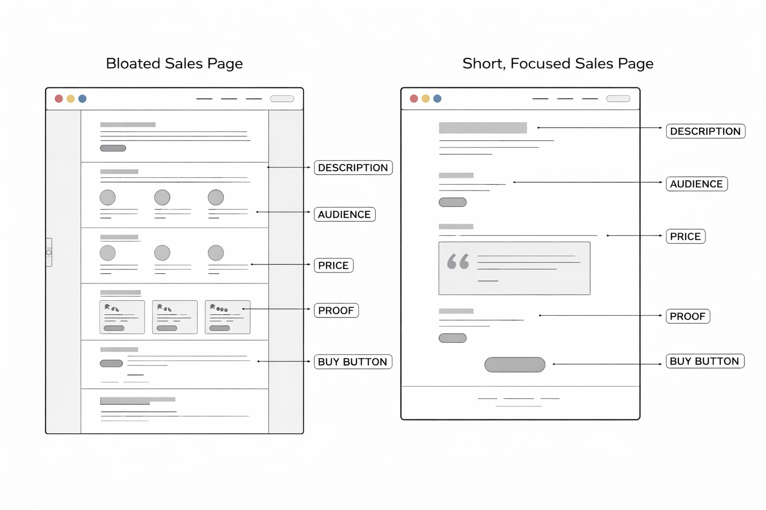
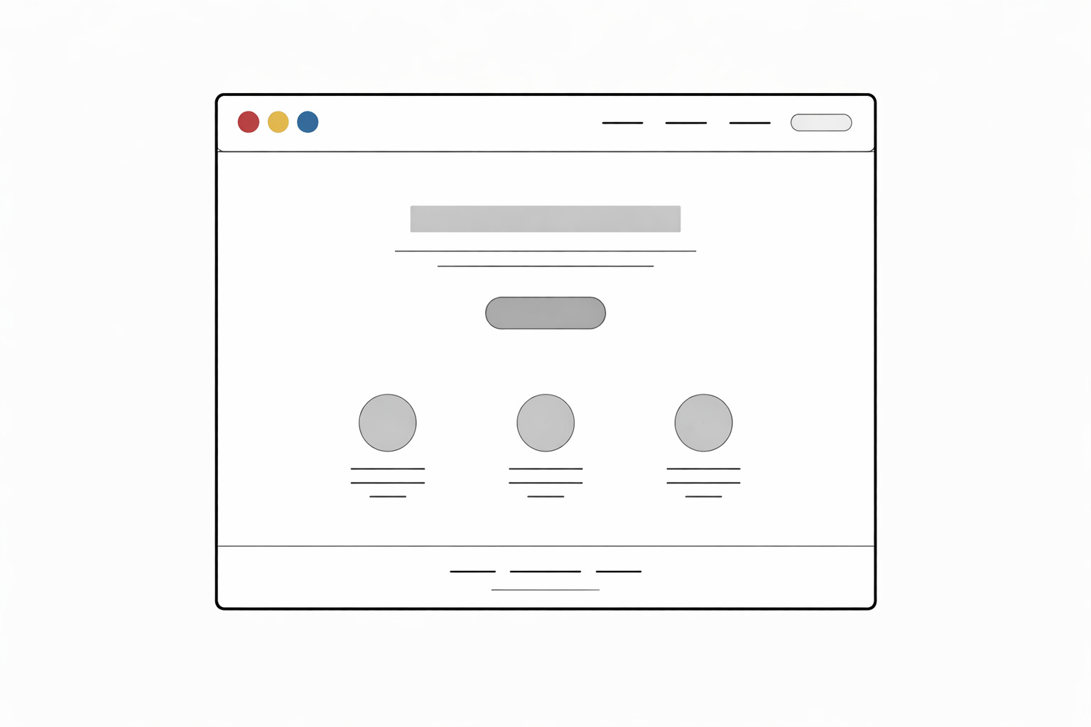
A sales page for a solo product needs five things. A clear description of what the product does, who it’s for, what it costs, proof that it works, and a way to buy it.
That’s roughly one screen of content on a laptop. Maybe two on a phone.
The description should be specific enough that someone can read it and immediately know whether this is for them. “A Notion template for freelance designers to track projects, invoices, and client communication in one place” does more work than “The ultimate productivity system for creative professionals.” The first one filters. The second one could describe anything.
Pricing should be visible without scrolling. If someone has to hunt for the price, they’ll assume it’s too expensive or lose interest before they find it. Put the number on the page early and let people self-select.
Proof can be lightweight at the start. A screenshot of the product in use. A short quote from a beta user. Even a Loom video walking through the product counts. You don’t need fifty testimonials. You need enough to show that this is real and that someone other than you has used it.
The buy button should appear more than once. People reach the decision to purchase at different points while reading. A button after the description and another after the proof section covers most of them.
What you can cut
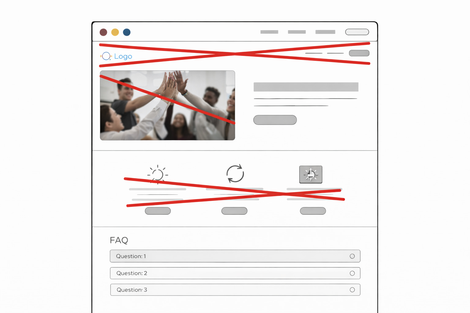
Hero images that don’t show the product. If your header image is a stock photo of someone smiling at a laptop, it’s taking up space and communicating nothing. Replace it with a screenshot or remove it entirely.
Long FAQ sections. If your FAQ has more than four questions, some of them belong in the product description instead. A FAQ that runs longer than the sales copy itself is a sign that the copy above it didn’t do its job.
“As featured in” logo bars, unless the publications are ones your specific audience reads. A TechCrunch logo means something to investors. It means very little to a wedding photographer deciding whether to buy your pricing calculator.
Comparison tables against competitors. These invite the reader to go look at those competitors. If your product is better for your niche, the product description should make that obvious without naming alternatives.
Animated anything. Scroll animations, counters that tick up, elements that slide in from the sides. These slow the page down and add nothing to the buying decision. Performance matters more than polish, especially on mobile.
The thirty-minute version
Open a blank page. Write one sentence that says what the product is and who it’s for.
Below that, add a screenshot.
Below the screenshot, write the price and add a buy button.
Below the button, add one or two lines of social proof.
Add another buy button at the bottom.
That’s a working sales page. It won’t win design awards, but it will convert better than a bloated page that takes three weeks to build and buries the buy button below the fold.
You can improve it over time. Add a short section on how the product works. Swap in better screenshots. Collect more testimonials as customers come in. But start with the minimum and let real traffic tell you what’s missing, instead of guessing upfront and adding things nobody asked for.
Why this matters for solo founders
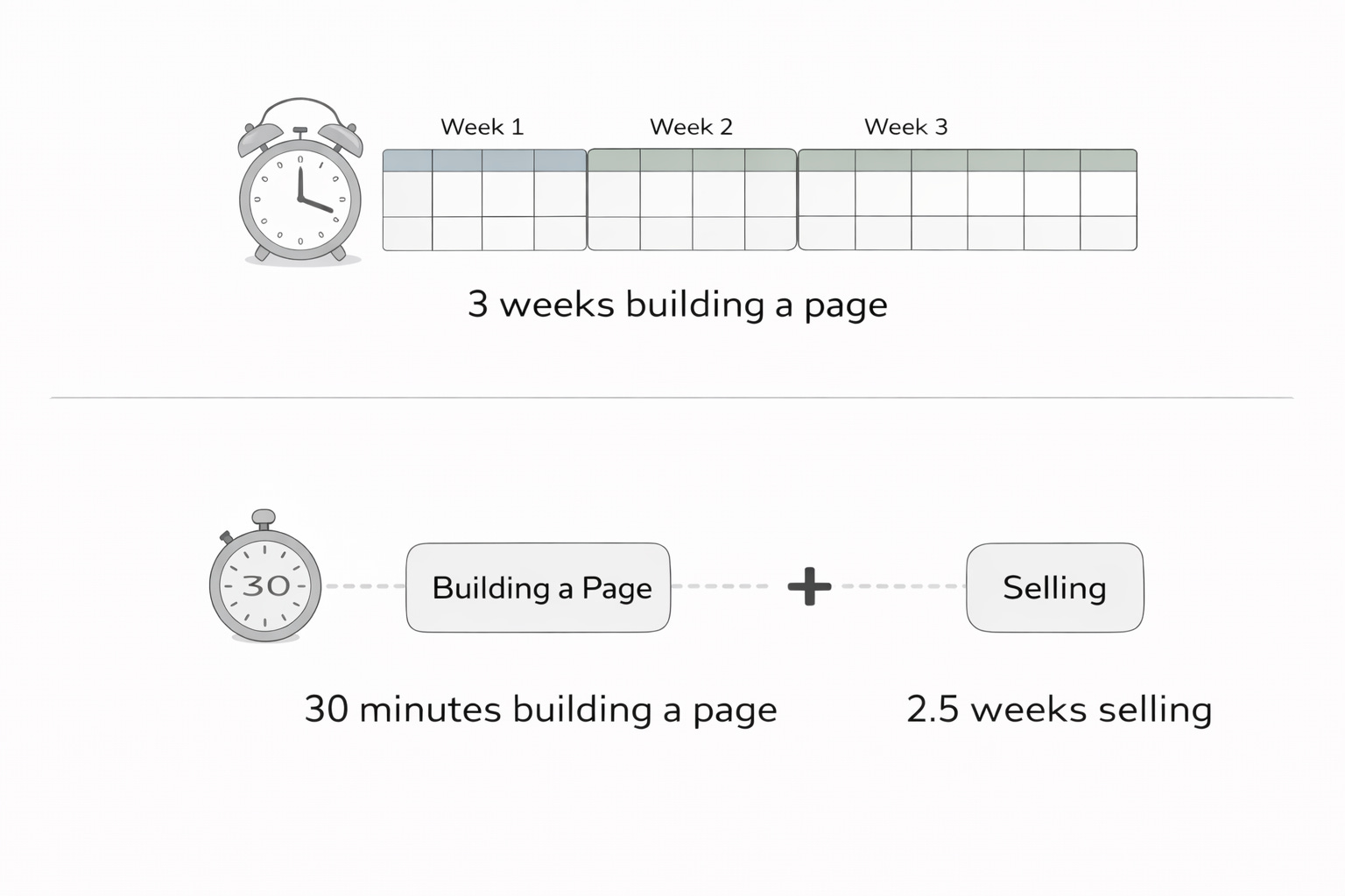
Time spent on a sales page is time not spent on the product, on marketing, or on talking to customers. A page that takes three weeks to build has to convert dramatically better than one that takes thirty minutes to justify the lost time.
In most cases it doesn’t. The founders I’ve watched hit their first revenue milestones tend to have simple, clear pages that load fast and explain the product in plain language. The ones who stall are often still tweaking their landing page months after they should have started selling.
Ship the page. Send traffic. Watch what happens. Rewrite the parts that don’t work. That feedback loop teaches you more about your customers than any amount of copywriting theory, and it starts the moment you hit publish.
Community Spotlight: Christian Orsos
Building an AI Niche Finder in 30 Days: Part 2 Watch video
Christian Orsos is two weeks into the Fastshot x Adapty Challenge, a 30-day hackathon to build and ship a real mobile app with a $5,000 prize pool. He’s documenting the whole thing on video.
Last week he had a prompt. This week he has a working app. Fastshot’s AI generated 22 files and a complete navigation flow from his original brief. Ten minutes in, he had a testable prototype. The app collects your skills, interests, and ambition level, then runs them through a niche discovery engine that returns scored opportunities with growth data, competition levels, and monetisation blueprints.
Not everything works yet. Trending cards aren’t clickable, and he got stuck wiring up Adapty for in-app purchases. His rough pricing: five free niche reports per month, $10.99/month for unlimited. Next week he’s covering beta testing and first users.
Want in? Join the hackathon for a chance at the $5,000 prize fund. Tag @nocodefounders and we’ll feature the best stories here every week.
Ready to build a 6-figure solo business?
Depending on your goals, there are 2 ways we can work together:
JOIN PRO MEMBERSHIP Learn more
Get full access to all our resources with Pro Membership for a one-time payment of $149.
💰$50k in Perks: Access Exclusive offers from the top no-code tools who have partnered with us. Including $15k waived Stripe fees, $500 Bubble credit + $1000 Coda credit View all
💻 No-Code Operating System: Advanced Notion template that replaces all your productivity tools. Everything you need to launch and manage your business from one page. Learn more
🎓 Course: Tiny Empires Method: Learn how to build a 6-figure business that works around your life and not the other way around. Learn proven frameworks to stop wasting time and start making money. Learn more
🎓 Course: Sales for Introverts (and people who don’t like selling): Learn how to sell in a way that fits your personality and delivers consistent, reliable revenue for your busines. Learn more
🛠️ 75+ Curated No-Code Courses and Resources: We’ve curated 2000 no-code videos into 75+ easy to navigate courses. Save yourself hours of watching Youtube videos that don’t move your knowledge forward. View all
SPONSOR THIS NEWSLETTER Learn more
Want to get in front of 34k+ other founders and makers building business faster using no-code and AI tools.